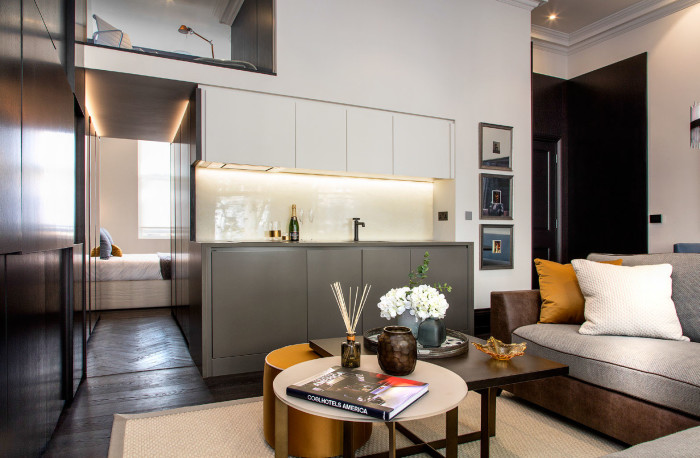
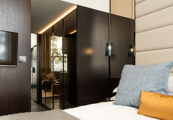
knightsbridge Project: Apartment 2
8th March, 2017 /
Apartment 2 from our Knightsbridge development. This is a basement apartment with an internal courtyard ‘garden’. In the summer, the bi-fold doors from the bedroom and living area open out to make this one large space (see last photo). The ceilings are high for a basement apartment which makes all the difference. This apartment was interior designed using lots of green elements to bring the outside in. Again, lots of textured, natural fabrics used for depth.
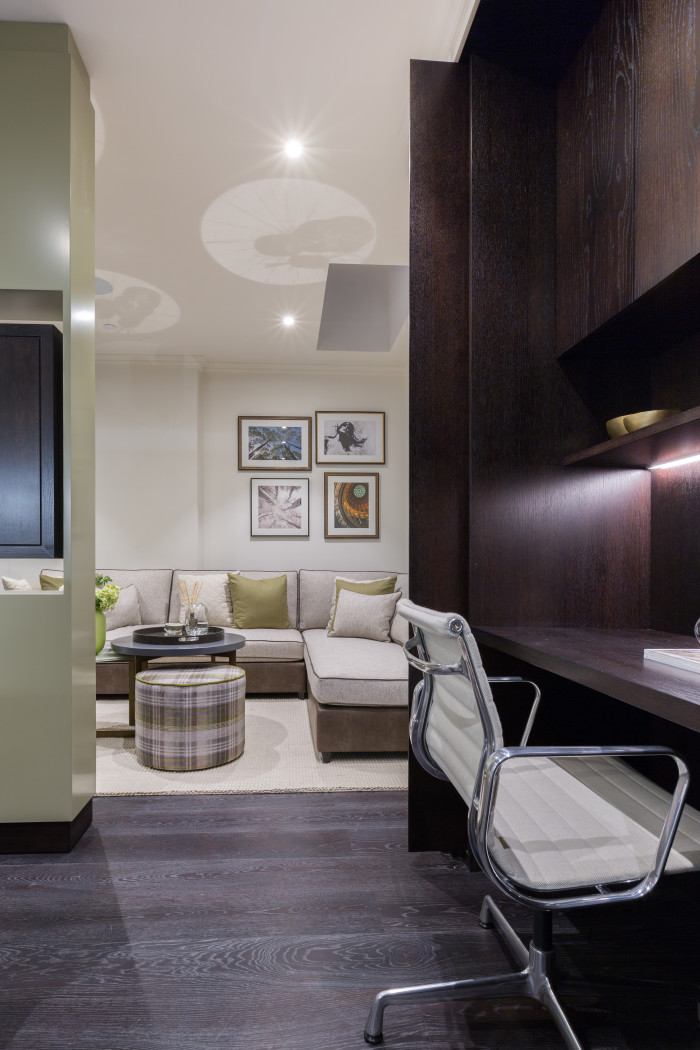 {Kitchen with hidden study looking through into the living area}
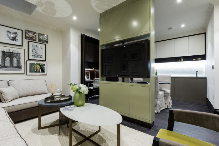 {Living area looking into Kitchen with swivel TV}
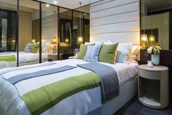 {Bedroom area with mirrored wardrobes as before}
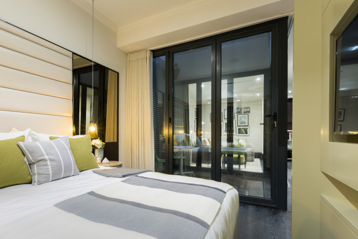 {Bedroom area looking through central courtyard into living area}
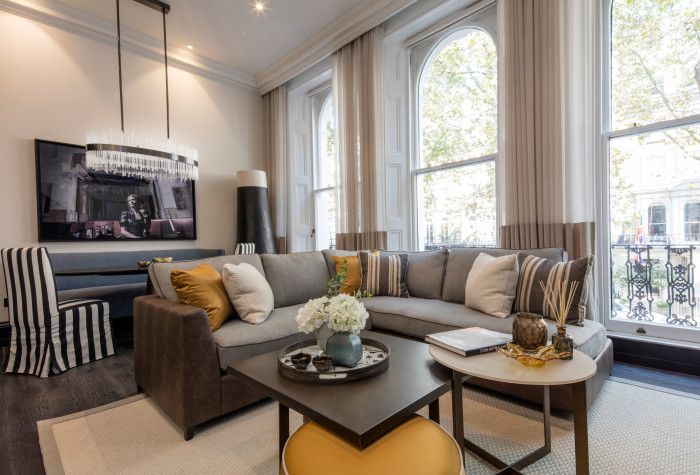
Knightsbridge Project: Apartment 5
21st October, 2016 /
Photos from a 2 year development project in Knightsbridge. This is the design and creation of 9 Studio apartments over 7 floors. The scheme is dark wood mixed with white walls and lots of textured natural fabrics in linens, wools and velvets which bring in a hit of colour. This is the main show apartment. Two more to follow….
Serenity in 2016….
12th January, 2016 /
During my summer trip to France last year I fell in love with the most divine colour on some shutters in the local village. Transpires its one of the Pantone colours for Spring 2016:
 {Photo by Helen Ford)
Copper & Rose Gold
13th October, 2015 /
I’ve just been to see a new development where the bathrooms sported copper taps. Very nice to see them in situ although I think its pretty challenging to get other door furniture/sanitary ware within the room/apartment to work with this distinct look (the plug was still chrome which seemed a desperate shame). Still, it got me thinking about the vibe and how this colour/finish translates so well from interiors to fashion……
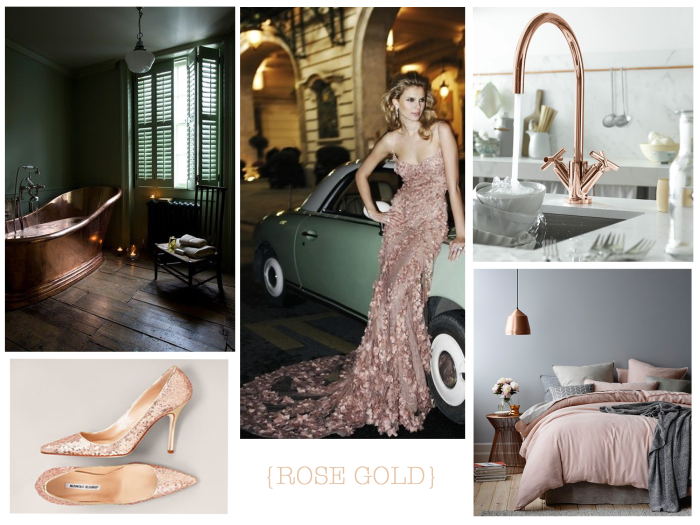
{Photos: Pinterst)
Completed Project: Chelsea Family Home
2nd August, 2015 /
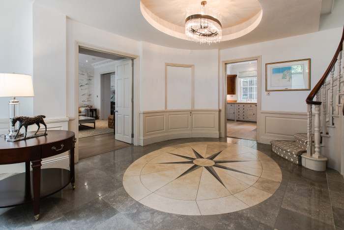
Entrance Hall….
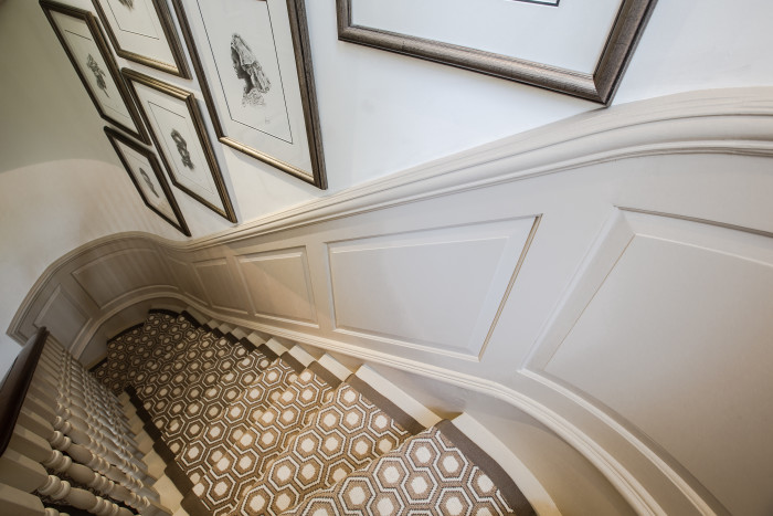
Here are the first photos from a recently completed project in Chelsea. This was a project with minimal building works – primarily full re-decoration and soft furnishings. There are some great before and after shots which I am currently working on.
This is the Entrance Hall. Before it was very cold with grey wood panelling, a grey and white damask wallpaper and grey carpet to the staircase. I wanted to pull out the colour of the existing marble in the Entrance hall to warm up the space. We opted not to re-wallpaper for practical purposes (sticky fingers) as well as some awkward nooks and crannies as you move up the staircase. The bronze chandelier was selected as its oval to work with the existing coffer ceiling and to reflect the oval design of the existing floor.
The Moodboard showing the original concept is below….

Christmas Carousel
22nd December, 2014 /
I just love living in London and recently I happened to be walking past the Natural History Museum just as they’d set up their Christmas Ice Rink. I couldn’t resist taking a photo; I just loved the magic of the Carousel against the colourfully lit back drop of the Museum.
Now where is Mary Poppins?
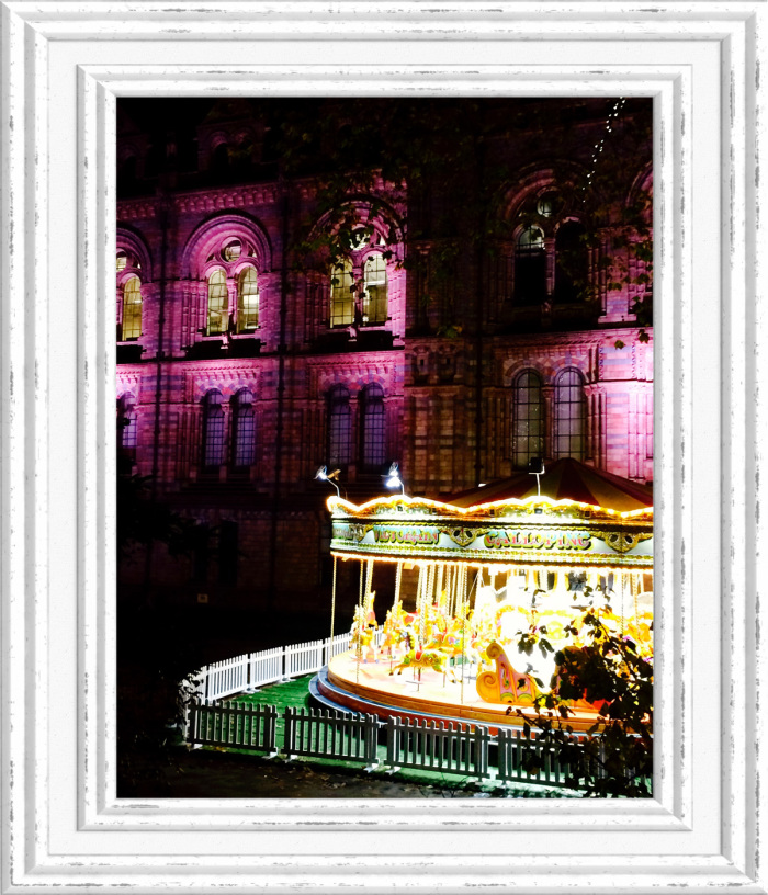 {Photo: Helen Ford}
 {Kitchen with hidden study looking through into the living area}
 {Living area looking into Kitchen with swivel TV}
 {Bedroom area with mirrored wardrobes as before}
 {Bedroom area looking through central courtyard into living area}


